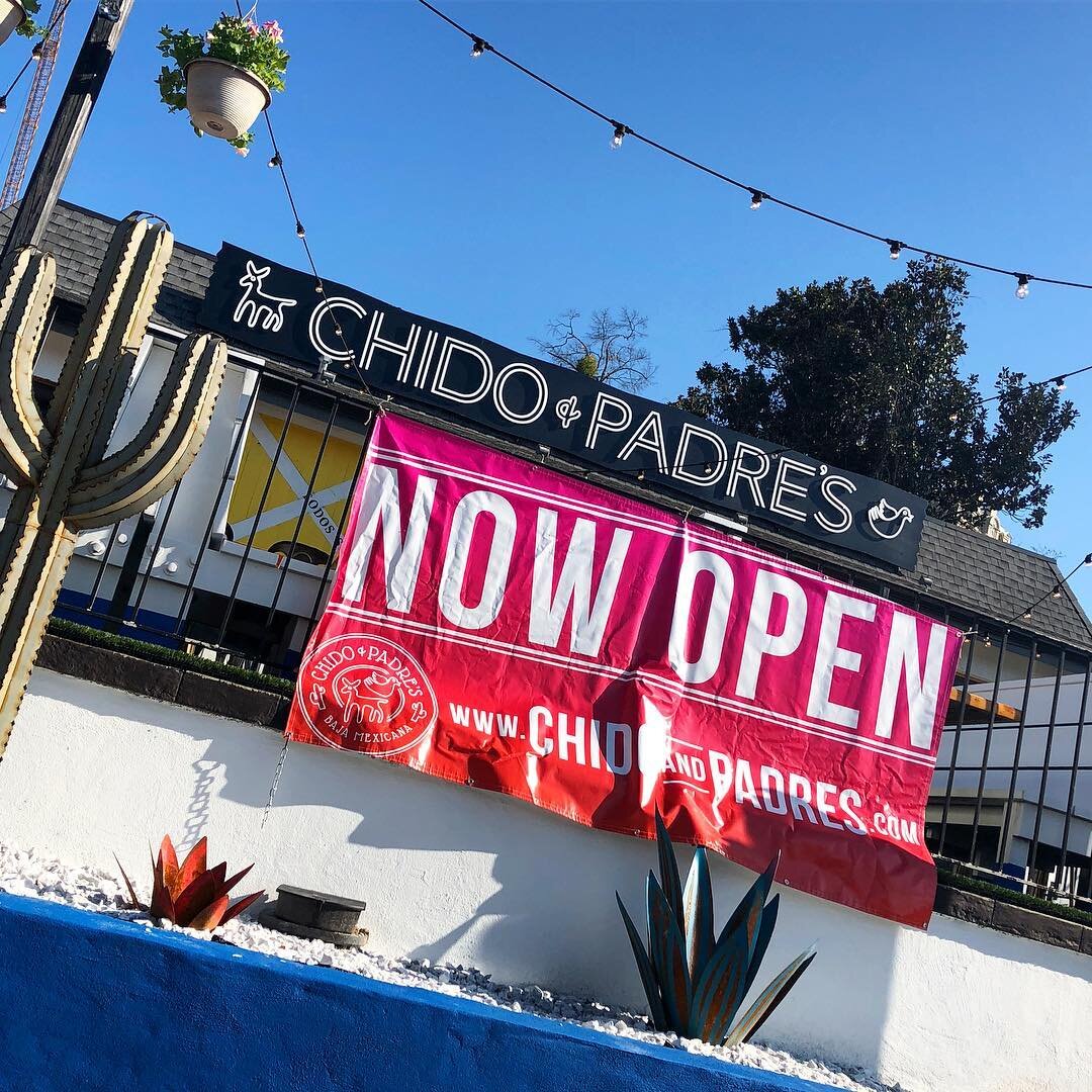
Chido + Padre’s Baja Mexicana
A Trendy New Cantina
A new restaurant brand that draws on tradition to inform a modern aesthetic.
BRAND ID | menu DESIGN | banner design | Business card DESIGN


Design Objective
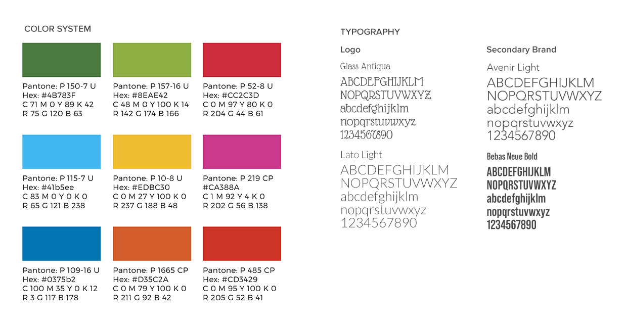
To create a brand system that embodies a contemporary minimalist interpretation of the traditional Otomi (Mexican fabric print) style. Client directives: must include the likeness of a dove (Chido) and a donkey (Padre), and develop a diverse, vibrant color palette to complement the black + white logo.
Project Brief
Following the traditional style of the Otomi, design a logo and brand system for a cantina-style Mexican restaurant in a young, urban section of Atlanta, GA. In addition to the logo, design five menus, business cards, and hanging banners.
Approach
I began by researching the Otomi fabric styles, looking for similarities between different fabrics, and determining where liberties could be taken. I also researched the origin of the style and its current uses, while working closely with the interior design team to ensure that my designs would complement and work with the overall feeling of the restaurant.
Outcome
As a result of performing thorough research and analysis, this brand encompasses the spirit of the Otomi while maintaining a modern aesthetic.
Concept
Visual Inspiration
Brand Identity
Color System and Brand Typography
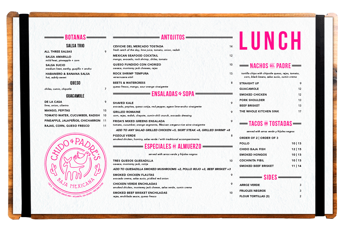
Menu Design