Fuzion
An essential oil line created in support of alternative medicine.
Focused on providing information about alternative options to Western medicine by providing comparative solutions to everyday ailments, and selling proprietary essential oil remedies.
BRAND ID | package design | Web design | print DESIGN
Design Objective
To provide comparative information on natural, physical, and pharmaceutical remedies for everyday ailments, and create a sellable, proprietary line of natural remedies in the form of essential oils.
Project Brief
This social awareness project aims to provide detailed information about the benefits of employing various methods to achieving optimum health and relief from minor ailments. By investigating Eastern, Western, and Physical methodologies, we examined and made recommendations about a variety of everyday options that each have distinct benefits.
Approach
Through extensive primary research, competitive market research, and a variety of brainstorming methods, we found an opportunity to elevate the general public’s knowledge of holistic remedies. We approached this project with a mindset of education, and through that we create a company with an informative website, a product line, a point-of-purchase display, and a motion graphic advertisement.
Outcome
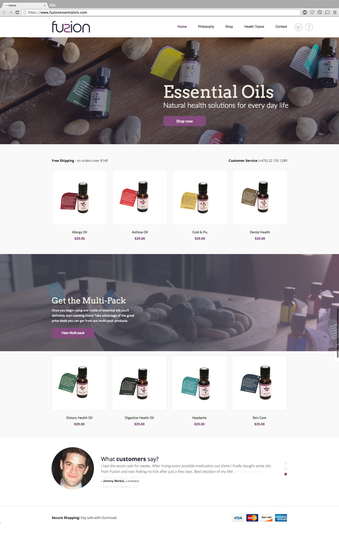
The brand identity works to fuse together a mindset of science + holistic. The website educates users, forcing them to consider Eastern, Western, and Physical resolutions to everyday ailments, and then provides an opportunity to purchase proprietary essential oils blends, pre-mixed for ease-of-use.
Challenges
Our biggest challenge with this project was in the research phase. Since there aren’t many scientifically-proven research studies about the effectiveness of holistic remedies, we had to ensure that we provided a fair amount of information on all three medicinal approaches. Most of the information and products on holistic remedies exists in a vacuum, in that they are not approved by the FDA, which causes many people to mistrust the safety of these products.
Visual Inspiration
Concept
Natural. Physical. Pharmaceutical.
Fuzion encourages people to consider this approach – in this order – to enhance their overall well-being. The name was derived from “Fusion: the process or result of joining two or more things together to form a single entity.”
Brand Identity
Package Design
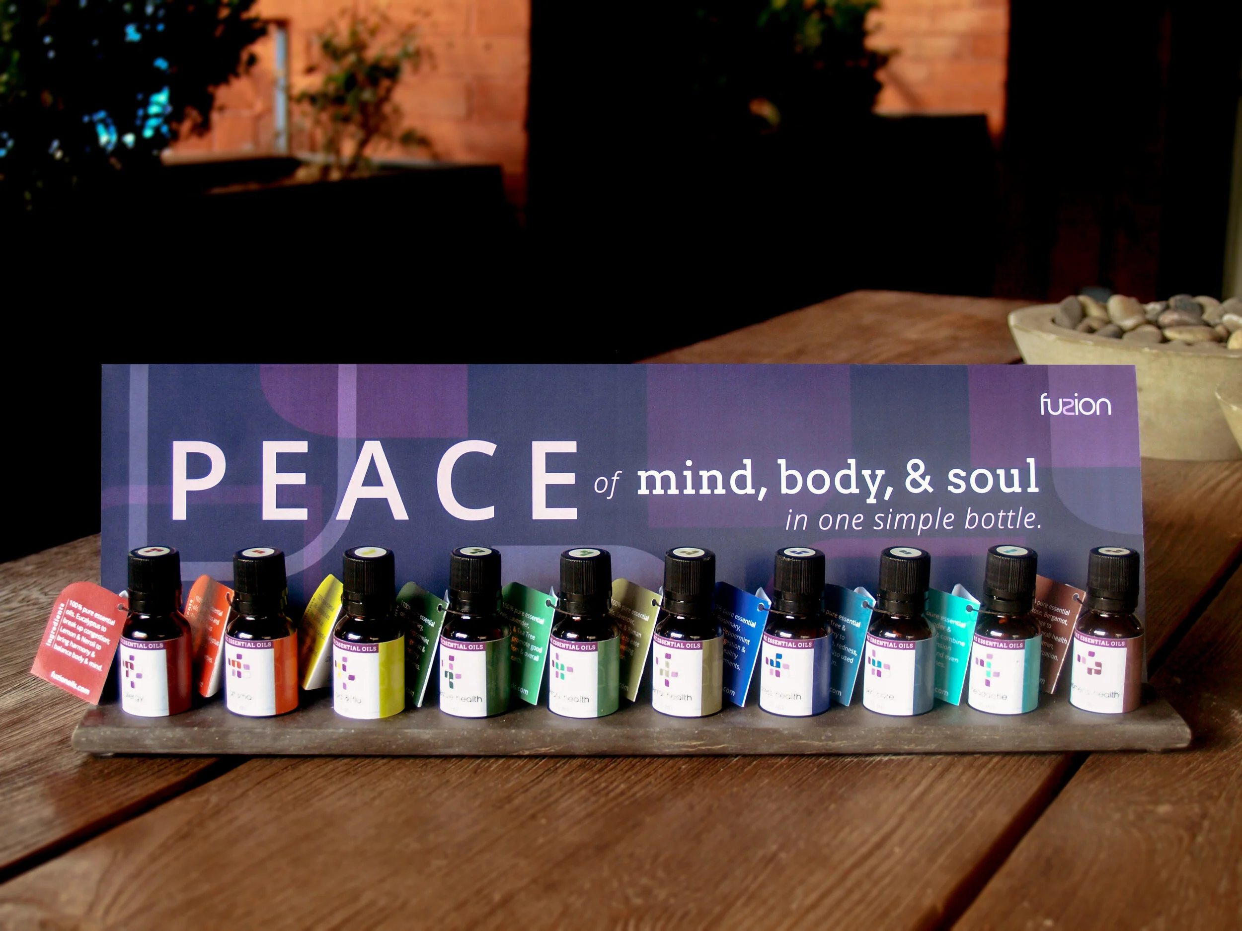
Fuzion’s essential oils package design is derived from the logo mark. Using the shape of the mark, the concept of fusing together a variety of essential oils for each proprietary blend (10 products in total), and color, we arrived at the following symbol system. Each symbol uses the primary brand colors as the base and has a unique, colorized shape within it. The colorized portions have been “fused” together and are comprised of either two or three shapes, which represent the amount of oils that are blended within each bottle.
Advertisement
Point of Purchase Display
Website


