Münich Transit System
A Transit Mapping System
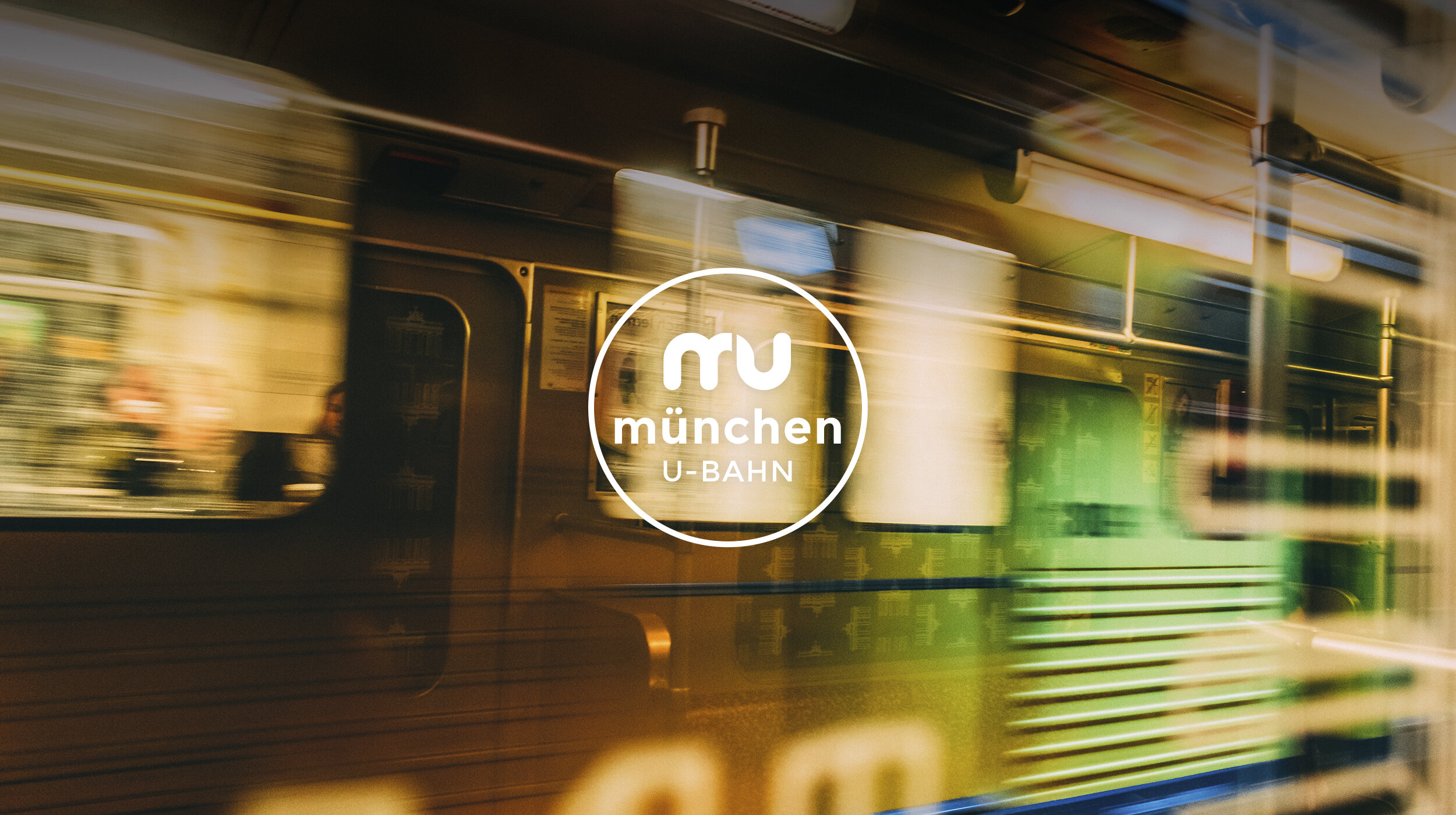
A subway map re-designed for ease-of-use, featuring a new companion mobile app to help travelers navigate the U-Bahn subway system in Münich, Germany.
BRAND ID | APP DESIGN | print DESIGN | MAPPING SYSTEM


Design Objective
To design an intuitive transportation mapping system that offers travelers ease-of-navigation, information about the city, and ticket purchasing, packaged in a visual representation of Münich.
Overview
Project Brief
This information design project was to identify a transportation mapping system that could be functionally improved, fundamentally simplified, and aesthetically representative of the city, and then apply these identified traits to a physical map and a companion mobile app.
Approach
Through primary research and deep analysis, I worked to understand the existing issues and formulate a proposed solution. Using imagery of the city, I determined a personality for which to inform typographical choices, an icon system, primary and secondary color palettes, and overall functionality.
Outcome
The re-designed map focuses on legibility, functionality, and visual aesthetic. The newly designed mobile app focuses on user experience and ease of navigation, while providing real-time alerts and in-depth information for travelers.
Challenges
There were several challenges with this project. The map is in German – and I don’t speak German. German naming conventions are long and therefore cumbersome, posing a typesetting obstacle. The most significant challenge encountered during this redesign was in finding a method for simplification without losing anything in translation, and then developing a grid structure that best represents Münich. The existing maps (shown here) do not really represent the city’s personality, and the maps are both cluttered and confusing to read. From 1971 (the best map design) through 2016 these maps became increasingly difficult for users to interpret.
Visual Inspiration
Concept

Re-Designed Map
Vibrant Structure
The mapping solution is gridded based on the golden ratio. The colors represent the bold and bright colors of the U-Bahn stations, set against a cool gray that is reminiscent of the architecture of the city. The back of the map gives information about the transit lines, the city, the complex ticketing system, and several historic attractions.
Back of map (click to enlarge)
Back of map (click to enlarge)
Re-designed Map (click to enlarge)
Brand Identity

PICTOGRAMS • ICONS
Mobile App UX Flow
This MOBILE APP is both a digital version of the transit system map, and acts as a self-guided tour of Münich, it’s attractions, planning and navigation, and live transit alerts.
ROUTES allows users to learn more about each of the various subway lines, ticket information, and purchasing capabilities.
PLAN YOUR TRIPS allows users to search locations on the map and plan routes in advance. Users can search by nearby locations, and then save their selections to favorites.
ALERTS informs users of real-time delays, displaying issues on an interactive live map, and suggests alternate routes for getting around the city.
ATTRACTIONS is a way for users to learn about various points-of-interest – from historic attractions to restaurants to sporting events and zoos.
